Spacing and sizing
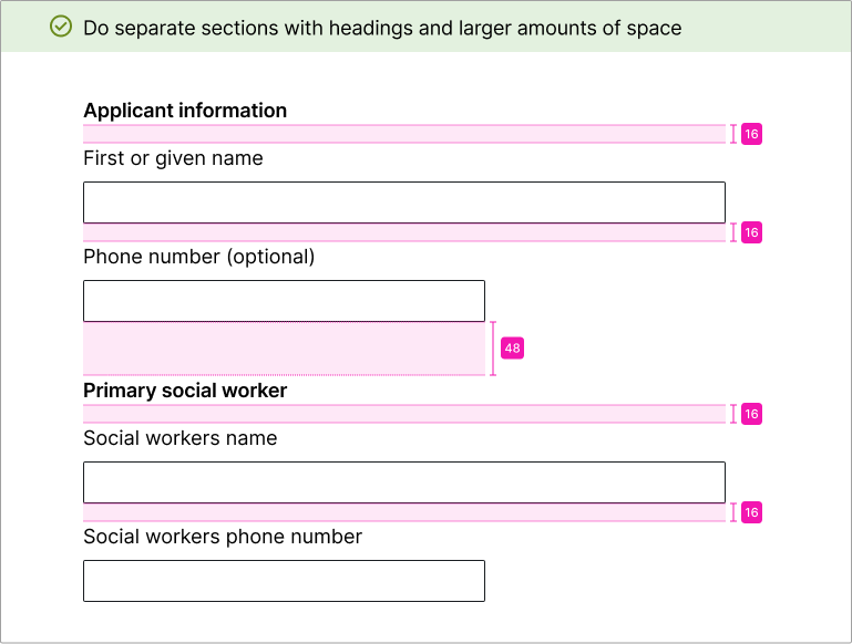
Spacing helps users see what information belongs together. Use spacing between items and sections to help guide users through a form.
Placing related items closer together will make those items seem related. Placing sections farther apart will help users understand where sections start and stop.
Spacing in desktop and mobile
Spacing of form fields should remain consistent between desktop and mobile. You should not need to add mobile-specific spacing between form elements.Section spacing
Use a larger amount of spacing between sections than between fields.
For a starting point, consider using double or triple the amount of space between fields.


Field spacing
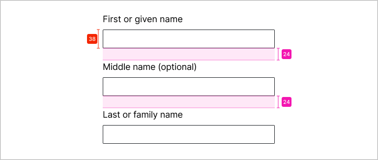
Spacing between fields should be smaller than section spacing. This allows fields in the same section to appear related.
It generally works well to space fields at 50% to 75% of the field height.

Sizing
Field width
Users rely on field width to understand how much information they must enter into a field.
Use shorter widths when you know how many characters someone will enter. Examples include zip codes (5 digits) or phone numbers (10 digits).
Use longer widths when you don’t know how many characters a user might need. An example would be name fields.

Sizing in desktop and mobile
On desktop, fields should not take up the entire width of large monitors. To ensure this doesn’t happen, specify a max-width on field elements or their container.
On mobile, it’s common to set fields at 100% width of their container. Continue to size fields by how much information the user will enter. For fields that don’t need a pre-set amount of information, allow them to grow as wide as possible. An example would be name fields.