Colors
Our color system reflects the diversity and vibrancy of Hennepin County. Consistent use of colors lets residents identify our products. It also supports the credibility and integrity of our information.
Use only colors from our county color palettes. The use of grey in some design elements is the lighter shade of the county's black.
Sometimes the county serves as a fiscal or administrative agent for other organizations. When we collaborate with them on a website, the website should follow county brand standards.
Brand colors
Colors work together to communicate the brand tone. They draw the user’s attention. Apply colors with care to avoid overwhelming the user.
Core colors
Rich core colors set the tone of a design. We should use them in combination with lots of white space. Core colors draw a user’s attention with anchor design elements, like a header or footer.
Each tile shows how the core color contrasts with black and white, and different font sizes. Each example shows if the color contrast passes or fails WCAG 2.1 AA standards. Font sizes and weights can affect whether it meets accessibility standards.
Use hex codes for digital graphics. When possible, use digital black and white instead of pure black and white in digital spaces. Pure black and white can cause usability issues.
Hennepin blue
Hex 0058a4
RGB 0, 88, 164
CMYK 100, 69, 0, 4
Pantone 293
White
Hex ffffff
RGB 255, 255, 255
CMYK 0, 0, 0, 0
Pantone White C
Rich purple
Hex 3e1151
RGB 62, 17, 81
CMYK 83, 100, 32, 35
Pantone 2627
Deep blue
Hex 113c66
RGB 17, 60, 102
CMYK 100, 80, 32, 25
Pantone 295
Digital white
Hex fcfcfc
In some cases large areas of pure white can cause eye strain to users in the digital space.
Digital black
Hex 221d1d
Pure black text on a pure white background creates intense light levels that overstimulate the eyes when reading text.
Accent colors
Use accent sets to add small pops of color. Only use one accent color set in a design to avoid a rainbow effect.
Accent colors help give meaningful feedback to users.
Blue accent colors
Hex 00aeef
RGB 0, 174, 239
CMYK 100, 0, 0, 0
Hex 44c8f5
RGB 68, 200, 245
CMYK 60, 0, 0, 0
Green accent colors
Hex 9fcc3b
RGB 159, 204, 59
CMYK 43, 0, 100, 0
Hex cbdb2a
RGB 203, 219, 42
CMYK 25, 0, 100, 0
Golden orange accent colors
Hex f7941e
RGB 247, 148, 30
CMYK 0, 50, 100, 0
Hex ffcb05
RGB 255, 203, 5
CMYK 0, 20, 100, 0
Warm red accent colors
Hex ce1432
RGB 206, 20, 50
CMYK 0, 100, 80, 15
Hex ef413d
RGB 239, 65, 61
CMYK 0, 90, 80, 0
Neutral colors
These 3 neutral colors help warm and soften design elements. We use neutrals most often in print.
Hex 928884
RGB 146, 136, 132
CMYK 14, 19, 21, 39
Hex a49e99
RGB 164, 158, 153
CMYK 11, 13, 16, 32
Hex ded3ce
RGB 222, 211, 206
CMYK 1, 7, 7, 12
Use of color
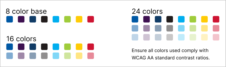
Palette types
If you need more color options, use either 25% or 50% tint of the county’s base color palette. Use the hex code value for tints, rather than adjusting the opacity. Avoid relying on opacity. It contrasts with any background color used which can have unpredictable results.
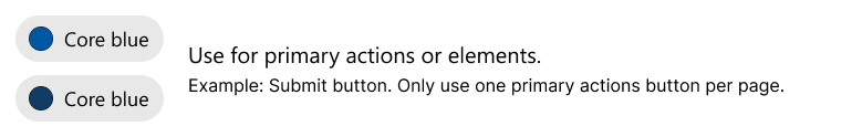
Color roles
Color roles add clarity to an interaction.
In this example, buttons use color to help users understand the intent of the action.


Color states
Color states help communicate the status of an interactive element. Create visual changes that convey a change in status. Use hovered, pressed, selected, and focused states.

Buttons guidance
Accessibility for colors
Don’t rely on color alone to communicate meaningful information. Colorblind or low-vision users may not be able to perceive color differences.
- Follow the WCAG AA standard contrast ratios.
- Include visual cues like icons. Screen readers don't announce colors.
- Ensure proper color contrast between elements.
For more information on accessibility, visit Designing for accessibility and Testing for accessibility.
Best practices for color use
Consistent use
Use one color for repeated similar interactions. For example, if you use red as a danger color on one screen, continue that. Don’t use red to mean something else.
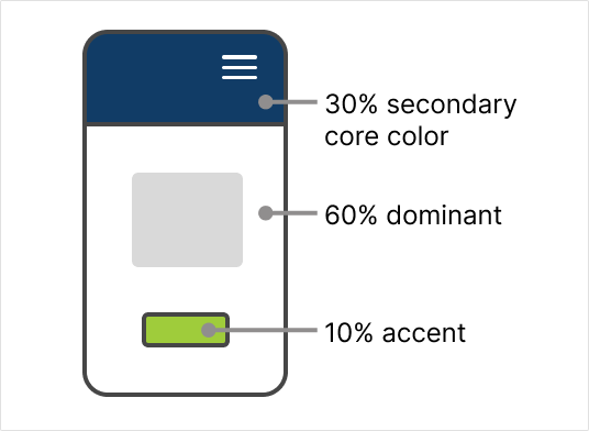
60-30-10 rule
This method uses percentages of color to help achieve color balance. It helps you avoid using too many or too few of the chosen colors.
- 60 percent: the main core color typically used for the background
- 30 percent: the secondary color to draw attention to an area, like navigation or the header
- 10 percent: an accent color reserved for items you want to stand out most on the page, like a call-to-action button