Responsive breakpoints
People access the internet through thousands of distinct devices. There are at least 10 major screen-resolution sizes in use. These and other factors create fragmentation.
Breakpoints determine when a webpage will adjust. Consistency across websites and applications when using breakpoints helps designers, developers, and users.
We can create user experiences that display content to different screen sizes. We can detect the user's screen size and content can stretch or shrink to that screen size. This is responsive design. We can create multiple content layouts for different screen sizes. We can then specify a size -- known as a breakpoint -- where the design layout changes. This is adaptive design. When people say responsive, they usually mean a combination of responsive and adaptive. It is best practice to set up each new website and application to use breakpoints. This makes it easier to add breakpoints in the future.
Defining breakpoints
Consistency across our websites and applications is important. When using breakpoints, use consistent sizes when possible. The industry standard is to set breakpoints at common screen sizes. These screen sizes correspond with mobile, tablet, and desktop devices.
When using breakpoints, you don’t have to use every size. Not every website or application needs to work on a mobile device size. Determine what sizes make sense for the users and use cases of the website or application first.
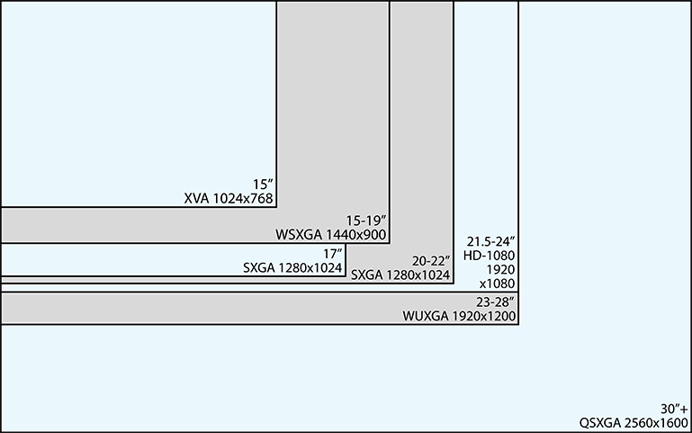
Breakpoint width sizes
When designing for specific breakpoints, design for the amount of screen space available. This will likely be smaller than the screen size. When running full screen, the window may be the same size as the screen. When not full screen, the window is smaller than the screen.
|
Size name |
Breakpoint width |
Device examples |
Window size examples |
|---|---|---|---|
| Extra extra small | 0px to 639px | Wearables, phones, standard definition TVs |
320px by 569px, |
| Extra small | 640px to 767px | Phones, tablets | 640px by 480px |
| Small | 768px to 1023px | Tablets | 768px by 1024px, 800px by 600px, 960px by 540px |
|
Medium |
1024px to 1279px | Laptops, desktops | 1024px by 768px |
|
Standard or large |
1280px to 1535px | Laptops, desktops | 1280px by 720px, 1280px by 1024px, 1440px by 900px |
| Extra large | 1536px width or larger | Large monitors, ultra high definition TVs | 1536px by 864px, 1920px by 1200px |

Accessibility and usability standards
- Avoid horizontal scrolling when possible. Users should not have to scroll horizontally, unless viewing data in a table on a mobile device. Users won’t expect content to be hidden to the left or right of the viewport. Don’t rely on coding tricks like "overflow: hidden" to make it appear like all content is being displayed.
- Code text sizes so that users can increase or decrease the text sizes on their local device.
- Respect user-defined text spacing.