Developing for accessibility
Focus indicator
Keyboard focus gives users a clear visual indicator of their location on a web page. It also lets users know what they are interacting with.
Make all page functions focusable and available using the keyboard. The rare exception is for functions that users can’t do using only a keyboard.
Make the focus indicator clearly visible. The color of the focus indicator must contrast against the background color. It must also contrast against the colors of interactive elements.
Don't turn off the focus indicator or render it non-visible. For more information on color contrast standards, visit Designing for accessibility.
Beware the keyboard trap:
- Make sure keyboard focus never gets stuck on one part of the page (trapped).
- We must ensure users can navigate with only a keyboard. This doesn't apply to temporary traps, like modal questions.
Built-in interactive/semantic HTML elements are implicitly focusable. They have tab/DOM order and keyboard event handling built into them.
Don’t put focus on an element if a user can’t interact with it or give input. Only add focus to interactive elements. For example, don’t put focus on a paragraph of text. Before adding focus to an element, ask yourself if a user needs to interact with the element.
How users navigate the focus indicator
Tabmoves focus forwardShift + Tabmoves focus backwardArrow Keysnavigates a page either line by line (↑and↓) or letter by letter (←and→)
Tab/DOM order
The application must follow a logical tab order. They must go from top to bottom and from left to right in DOM order.
To find a missing focus indicator, type into the console: document.activeElement
The tabindex global attribute
Interactive elements don’t need a tabindex because it’s part of their native behavior.
tabindex="0" adds to the natural tab order:
- It’s best to avoid a value of greater than "0." It jumps an element to front-of-tab order which is anti-pattern and goes against the DOM order.
tabindex="-1" means not in tab order but calls on a focus() method:
- For example: a modal popup with a
tabindex= "-1"will draw keyboard events to it.Document.querySelector('#modal').focus() - For headings with a menu, use a
tabindex = -1 focus()method after the user-taken method (managing focus).
Semantics
Semantic HTML tells how an element functions or how it works with other content. It communicates this information to the developer and the browser.
Semantic HTML supports assistive technologies. It makes code accessible programmatically.
Role
A role is a particular user interface pattern applied to an HTML element. It defines what an element is or what it does.
For example, role = "checkbox":
aria-checked="true"is the state of checkbox (the state is "checked")- role and
tabindex="0"need to be on the same element so focus will go to the correct place
For more detail on the checkbox role, visit the W3.org checkbox pattern information.
Don’t define default semantics. You don’t need type="checkbox" and role="checkbox" for an <input> element. For more information, visit the W3.org rules of ARIA attributes usage.
Implicit semantic meaning
Browsers automatically recognize standard native HTML elements. Write HTML to express the semantics of the page. Semantic HTML has built-in accessibility.
User interface components
- Semantics determine the name and role of an element programmatically.
- Necessary states, properties, and values are set by default.
- Screen readers give information based on HTML and not CSS.
- Screen readers use an element’s role, name or label, value, and state (if applicable).
If a screen reader reads a form field for an email address, it will say, "Form field, your email address, edit text." The role is "edit text" and the name/label is "your email address."
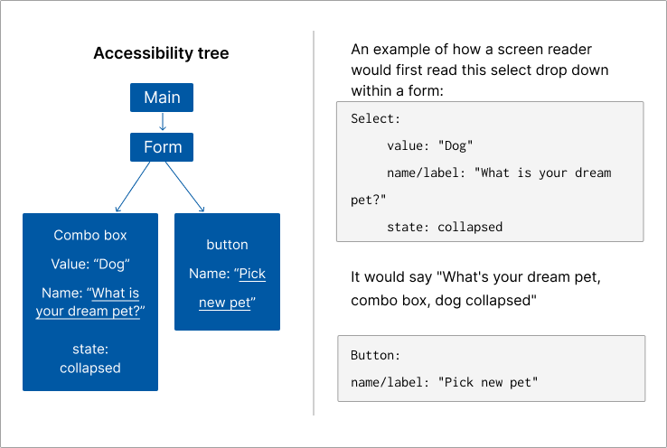
The browser takes the DOM tree and modifies it to turn it into an accessibility tree.
Be careful using <div> and <span>:
<div>(block element) and<span>(inline element) don’t have semantic meaning. They are containers for visual styling.<div>and<span>offer no information about the structure of a document or the tag’s content.- Use semantic HTML instead of assigning a class or id attribute to a
<div>or<span>. This helps ensure accessibility and readability.
Labels
Labels associate all form controls like text fields, checkboxes, and radio buttons. Labels help assistive technology refer to an element by its specific name, not only by its type or role. They are a quick and easy way to identify the function of each interactive element.
Form inputs have associated text labels. Make sure to create accessible labels for form input text labels.
To use a label element
- Method 1: Wrap the
<input>element in a<label>element. - Method 2: Use
for=""attribute on a label. Give the input element an id and use the same id for the attribute.
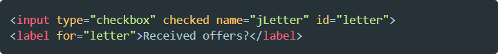
"Received offers?." If not labeled, the screen reader will only say "Checkbox checked." It won't give the name or label of the specific checkbox checked.
Alt text
Alternative text (alt text) gives the visual information of an image as text. Screen readers read alt text aloud to a user. Or the DOM displays the alt text if an image does not render.
For example, a screen reader would communicate “Portrait of the governor of Minnesota.” Or the DOM would display the alt text if the image didn't render.
<img alt="portrait of the governor of Minnesota" src="governormn.jpg">
Guidelines for alt text
- Apply alt text to all informative images, form image buttons, and image map hot spots.
- Use an empty alt text
alt=""for decorative images. These are images that don’t give information. - Remove an image from the accessibility tree using
alt="". Screen readers will skip the image.
Redundant images
A redundant image repeats content that’s already given. Redundancies can cause mental fatigue and cognitive overload. Use an empty alt text value for redundant images.
For example, a redundant image could be the magnifying glass image for the search field. A screen reader will read it as "Search field magnifying glass image." Since the user knows about the search field, they don't need to know about the magnifying glass image.
Navigation
Page navigation benefits all users when it:
- Is consistent
- Is clear
- Is well organized
- Follows an expected format that benefits all users
To make a page perceivable and understandable, use DOM order, landmarks, and heading levels.
Heading levels
Heading levels help establish the hierarchy of content. They are one of the most important features for screen reader users. For more information, visit Heading levels.
The importance of DOM order:
- Heading levels follow DOM order.
- Think of heading levels as a single stream of content.
JavaScript heading snippet:
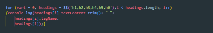
Add this code to inspect DevTools. The code will list out page headings in the console.
Links and landmarks
Link guidelines
- Always use an
<a href="…">. This shows up in link lists. It works automatically with keyboard and copy or bookmark link location. - Style links to look like buttons. But don’t use a
<button>element for links. - Use
alt="name"on image for link within an<a href>for images used as links. - Rely only on the link text to convey the purpose of the link. Avoid Learn more. Instead use Learn more about responsive layouts, or Responsive layouts.
Landmark roles and HTML elements
Landmark roles and elements structure a web page. They help users understand content and navigate the layout of a page.
Roles guidelines
- Use native HTML elements instead of ARIA roles. Native HTML elements have attributes and properties built in. They don’t need a role attribute.
- Use roles to define an element or describe what it does.
- Decide on role and landmark use based on browser limitations.
Landmark elements and their corresponding role
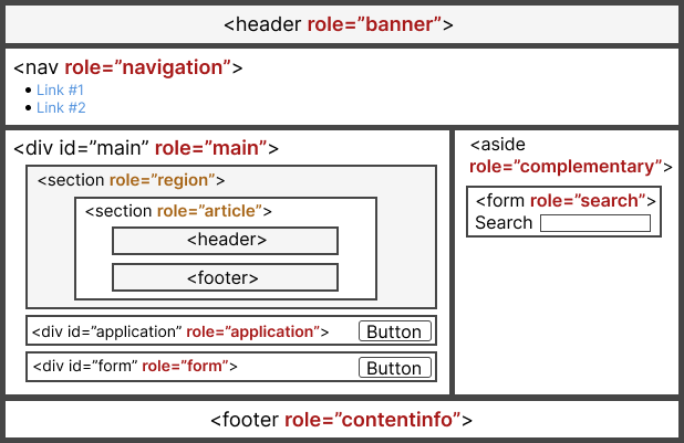
<header> element for role="banner" 1 per document
<nav> element for role="navigation"
<main> element for role="main" main content of page, 1 per document
<article> element for role="article" not a landmark role
<section>element for role="region" not a landmark role, generic section
<aside> element for role="complementary" content contextually related to other content (for example, a sidebar)
<form> element for role="form"
<footer> element for role=”contentinfo”, 1 per document
ARIA
ARIA allows you to add and change semantic HTML to make the DOM more accessible.
With ARIA you can:
- Express semantic relationships between elements beyond parent-child-sibling
- Make parts of page live (ex:
role="alert") - Clarify what semantic HTML cannot express on its own
ARIA does not:
- Change element appearance
- Change behavior
- Add focusability
- Add keyboard-event handling
A role is a promise, and ARIA roles don't cause browsers to provide keyboard behaviors or styling. You must incorporate JavaScript to provide the expected keyboard interactions.
ARIA can both cloak (coverup/override) and add meaning to original content. Don’t inadvertently override accessibility semantics. Assistive technology relies on ARIA to interpret information.
Common ARIA relationship attributes
These 4 attributes occur often. It's easy to confuse them with each other but they each have a distinct function.
aria-label
- This attribute specifies a label string only for screen readers.
- It overrides any native labeling. For example, if a button has a label and an aria-label, the screen reader will only use the aria-label value.
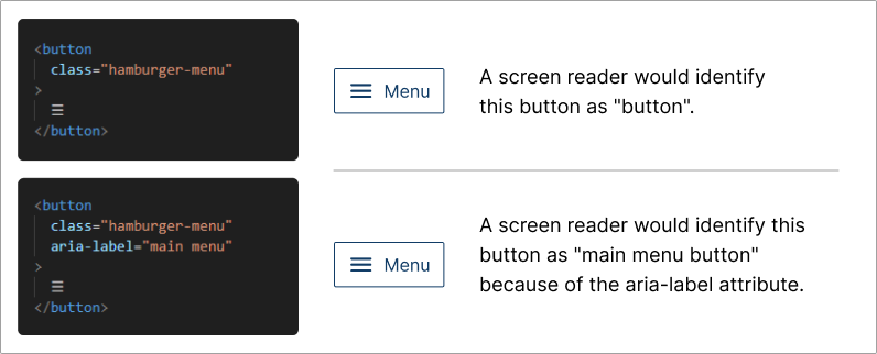
Example of an aria-label: clarifying a button as a hamburger menu
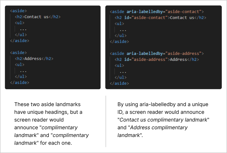
aria-labelledby
- Specifies an element ID to refer to another element in the DOM as this element's label
- Can use on any element but doesn’t enable clickable behavior like a
<label>element - Can refer to elements hidden from assistive technology
- Overrides all other name sources for an element (
aria-labelledby>aria-label)
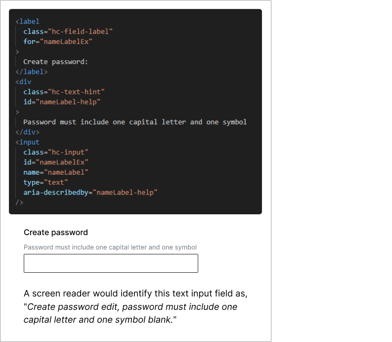
aria-describedby
- Provides an accessible description in the same way
aria-labelledbyuses a label - Gives supplemental but not essential information for assistive device users
- Allows for a lengthier description than
aria-labelledby - Hides an element from the DOM by adding
hiddento the<div id>
Example: password descriptive text
aria-owns
- Lets users know that an element separate from the DOM is a child of the current element
- Can specify the order of children (come after natively-owned children)
Example: menu and submenu items
<div aria-owns="submenu">, then using <div role="menu" id="submenu"> on the submenu element aria-owns presents the submenu as a child of the menu element
For more information about ARIA
For examples of relationships between elements, visit W3.org section on relationship attributes.
Article: No ARIA is better than Bad ARIA (ARIA Authoring Practices Guide)
Invisible content
You may want to make content visible or invisible to particular audiences. This can help prevent cognitive and visual clutter for different users. You can do this many ways depending on the specific user need.
Elements explicitly hidden won’t be discoverable by assistive devices.
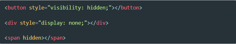
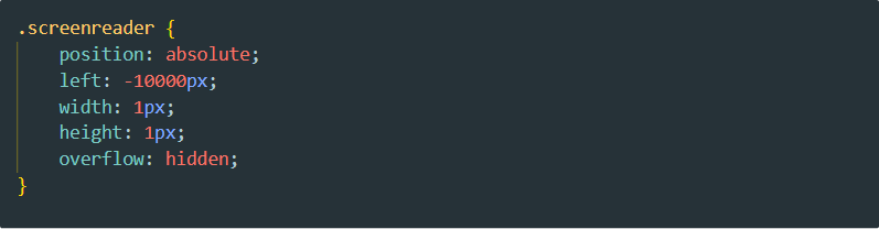
Example of hidden text only a screen reader can discover but sighted users won’t see
ARIA attributes can also hide elements:
aria-labelaria-labelledbyaria-describedby
The aria-hidden: true attribute:
- Hides an element from assistive technology but keeps it visible for sighted users
- Hides that element and all its descendants from the accessibility tree
Don’t use aria-hidden: true on focusable elements.
aria-live
This attribute gives live updates like status messages to users on assistive devices. It also specifies the feature or function of a page that needs to give live updates to a user. This attribute should occur in the initial page load.
aria-live="polite"
This attribute announces changes like when a user completes a simple action or task. Use this attribute for important but not urgent messages.
Example: a chat bot notifies the user that the user has a response in the chat field
aria-live="assertive"
This immediately interrupts the user with an important update or change.
Avoid using this for non-urgent updates.